


Choosing furniture for a beach resort or a pool is not only about functionality and comfort but also about reflecting a coherent and attractive aesthetic sense. One of the key principles that can guide this choice is color harmony, the art of combining colors harmoniously to create a pleasant and welcoming environment. In this article, we will explore the importance of color harmony in selecting outdoor furniture, with a particular focus on choosing seating for sunbathing or relaxation and entertainment areas, and how these elements can influence the brand identity of the facility and the development of the business
What is Color Harmony?
Color harmony is a discipline that studies the harmony of colors and their ability to influence people’s emotions and well-being. Applied to the design of outdoor spaces, such as beach resorts and pools, it can transform the atmosphere of the place, making it more inviting and relaxing for guests.
Choosing Colors for Seating
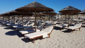
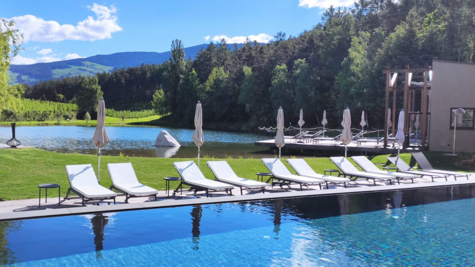
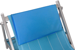
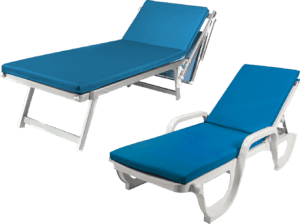
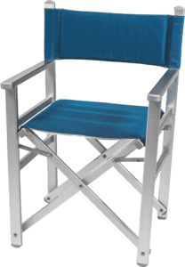
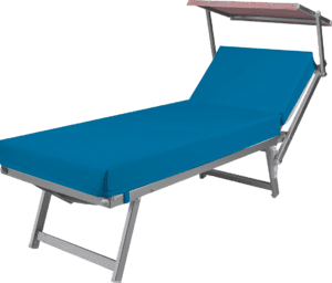
Sunbathing seating is a central element in the furnishing of any beach resort or pool. These furnishings not only need to be comfortable but also visually pleasing. Choosing colors that integrate well with the surrounding environment is crucial.

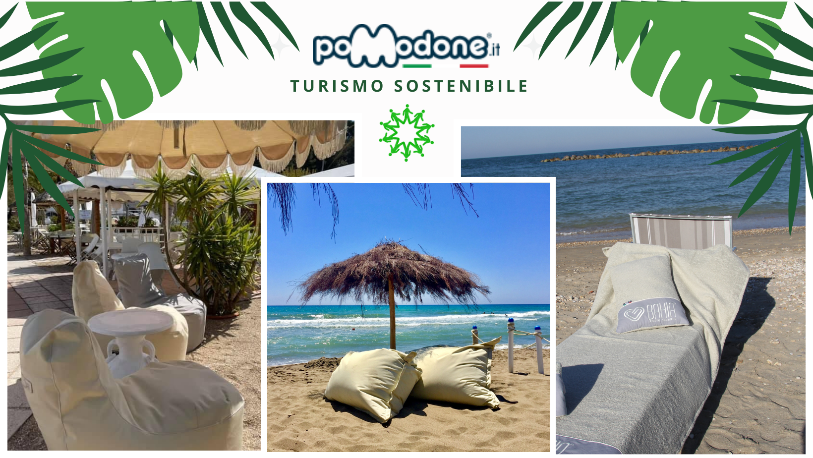
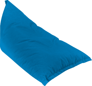
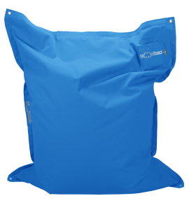
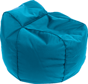
• Natural Tones: Colors like beige, olive green, and light blue can create an atmosphere of relaxation and tranquility, ideal for a beach environment. These tones harmonize well with the natural landscape, such as sand and water.
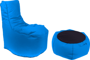
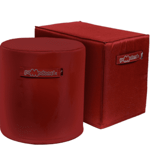
• Vibrant Colors: More vibrant tones like yellow, orange, and turquoise can add a touch of energy and vitality, making the space more dynamic and captivating. These colors can be used as accents to create visual focal points.
The Importance of Consistency with the Brand
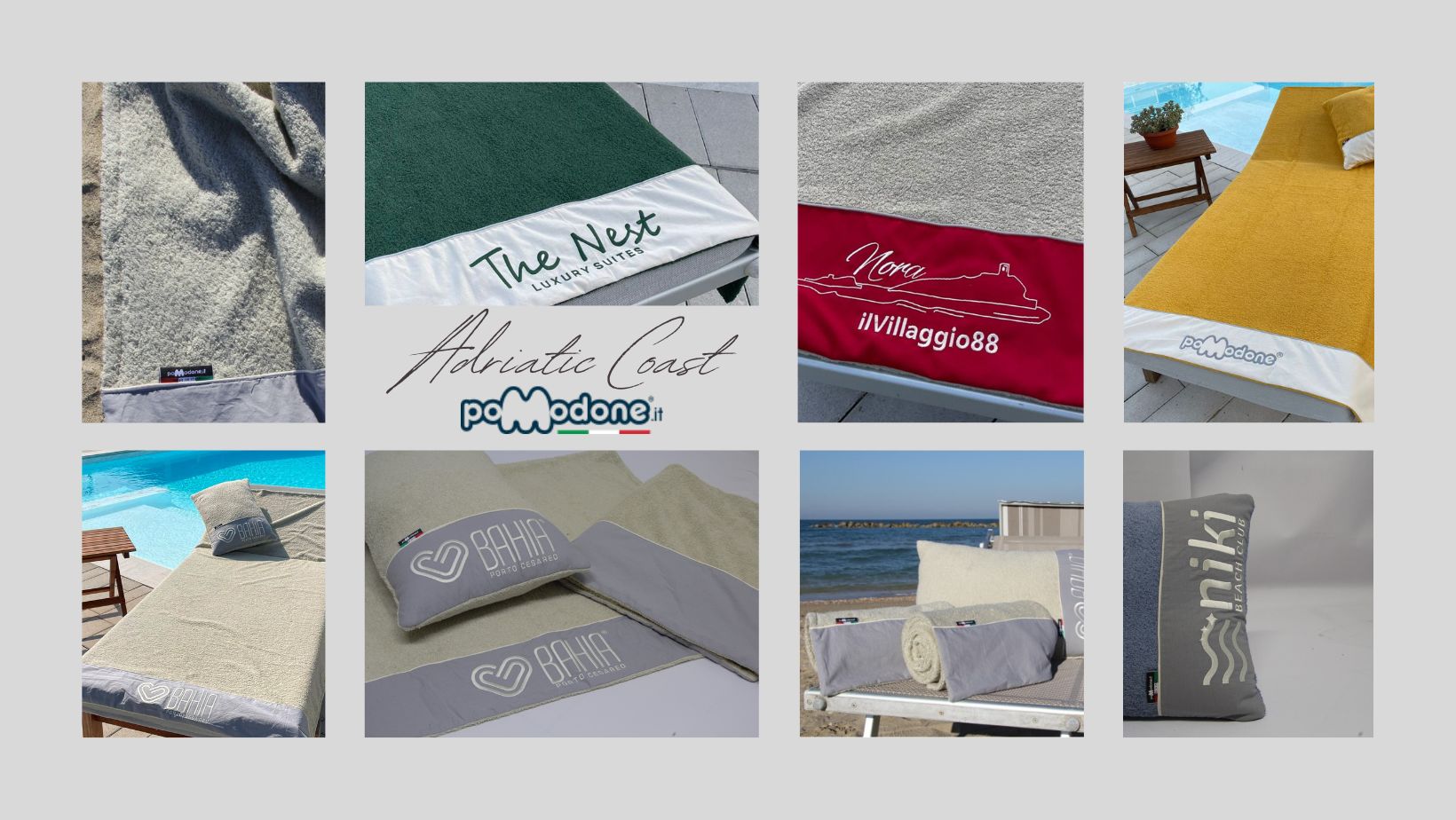
Color is a powerful tool for building a brand. The choice of furniture colors should reflect the visual identity of the facility’s brand. For example, if the facility’s logo uses a particular color, integrating it into the furniture can reinforce brand consistency.
• Visual Identity: Using colors that reflect the facility’s logo and promotional materials helps create a consistent visual experience for guests, who will immediately recognize the brand identity
• Professionalism: A studied and consistent choice of colors conveys professionalism and attention to details, elements that can positively influence guests’ perception of the facility.
Business Development and Guest Welcome
Investing in color harmony and the careful choice of colors can have a significant impact on business development and guest satisfaction.
- Guest Experience: A harmonious and well-furnished environment enhances the overall experience of guests, who will feel more comfortable and relaxed. This can lead to an increase in positive reviews and customer loyalty.
- Differentiation: In a competitive market, a facility that stands out for elegance and attention to detail in design is more likely to attract new customers. The wise use of colors can differentiate your facility from others, creating a lasting memory in visitors.
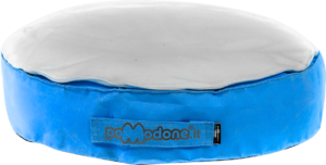
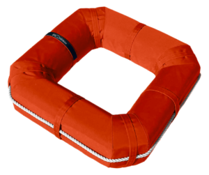
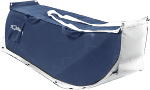
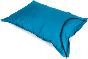
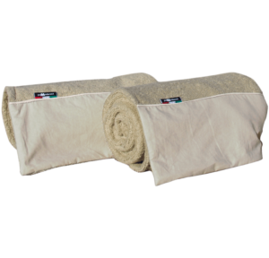
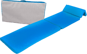
- Functionality and Aesthetics: Pomodone products, such as mattresses for beach and pool loungers, offer not only comfort and quality but are available in a range of colors that fit any color scheme. This allows for a perfect combination of functionality and aesthetics.

Transform Your Facility with Pomodone

Choosing furniture for beach resorts and pools, guided by color harmony, is a fundamental aspect of creating a welcoming environment in line with the facility’s brand. Using colors that reflect the brand identity and harmonize with the surrounding environment can significantly improve the guest experience and contribute to business development.
For more information about our products and to find out how we can help improve the comfort and style of your facility, visit our website or contact us directly.
Pomodone is synonymous with quality, design, and well-being.